Beyond Inter & Roboto — 13 Fonts I Actually Reach For
Inter and Roboto are fine defaults. I just got tired of reaching for them every time.
Lately I've been picking type for UI and landing pages again, and my hand still drifts back to Inter. I don't hate it — I've just used it so much that everything starts to look the same. These 13 are the ones I actually open when I want a bit more design taste, and they're all free for commercial use. Two sources only: Google Fonts and Fontshare.
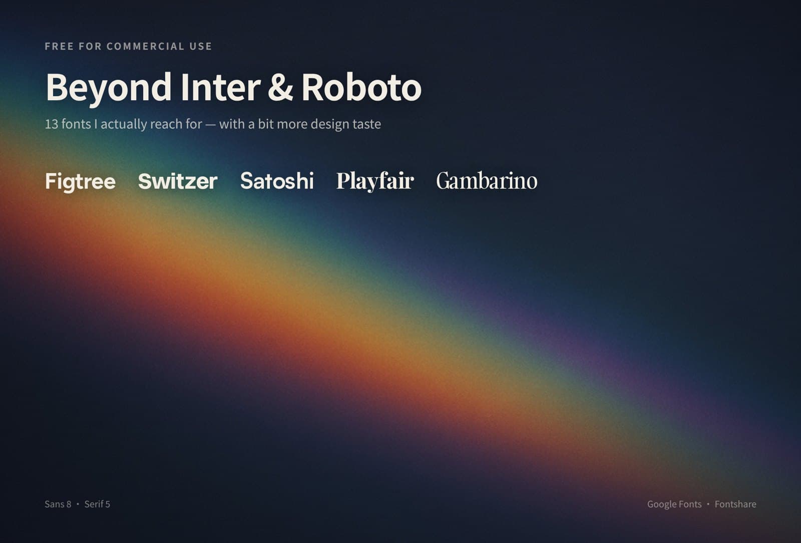
Eight sans, five serif. On every poster, the name is set in that font itself.
Sans
Figtree
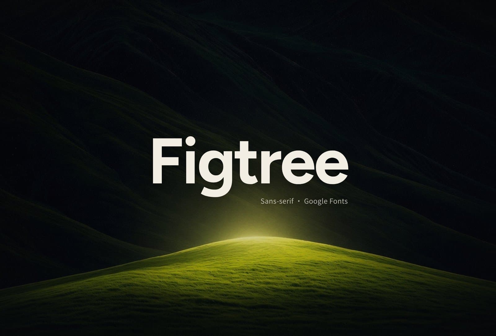
Google Fonts. Soft geometric, friendly rounded corners. Easy pick for product sites and light landings when I don't want something hard-edged.
Rubik
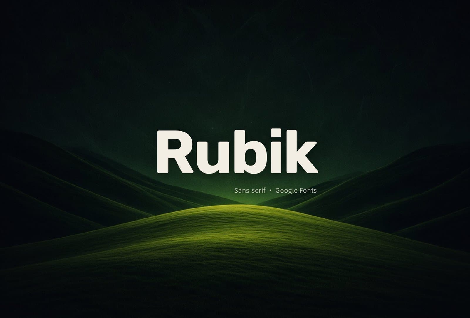
Google Fonts. Slightly rounded geometric sans with a full weight range. Good for titles, cards, interfaces that want a little bounce.
Switzer
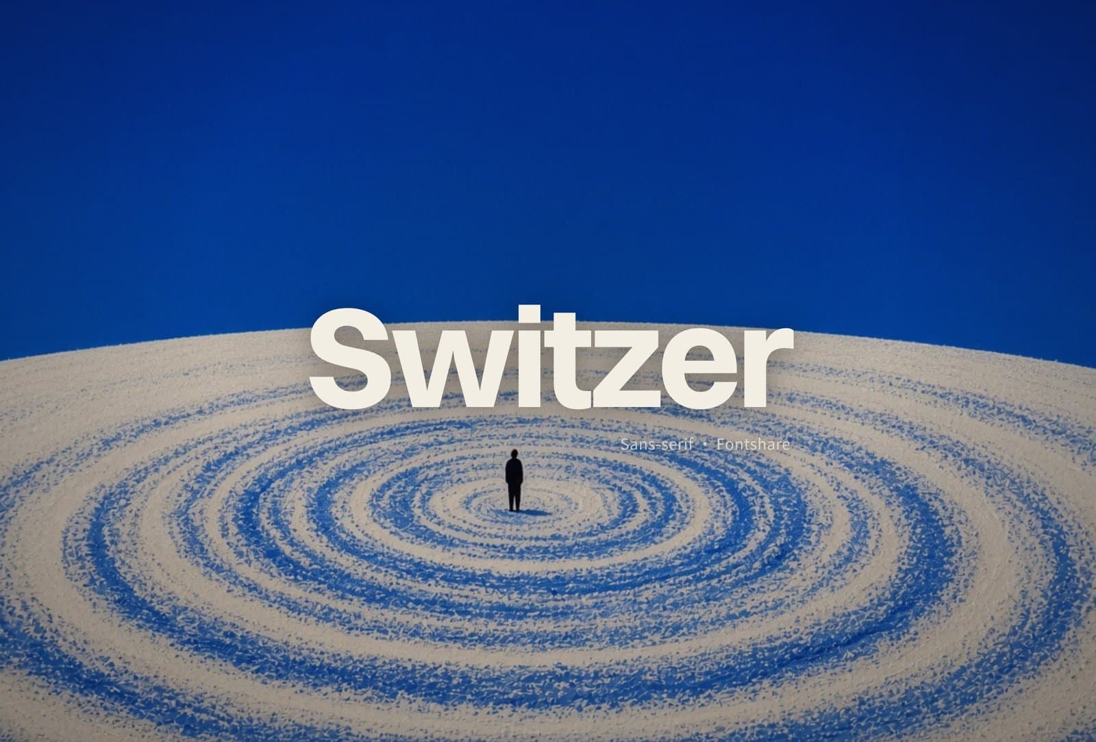
Fontshare. Neo-grotesque, clean and sharp. When I want Inter-ish "system" energy without the default look, I swap to this.
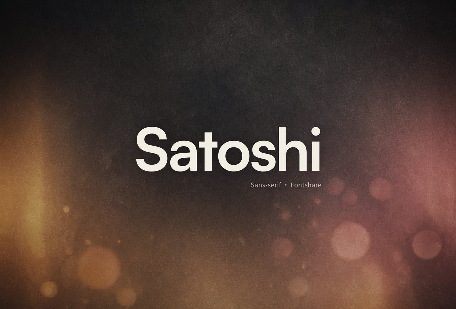
Satoshi
Fontshare. Modern geometric sans. Shows up a lot on brand and marketing pages, but the shapes are solid. I pull it for main titles and nav often.
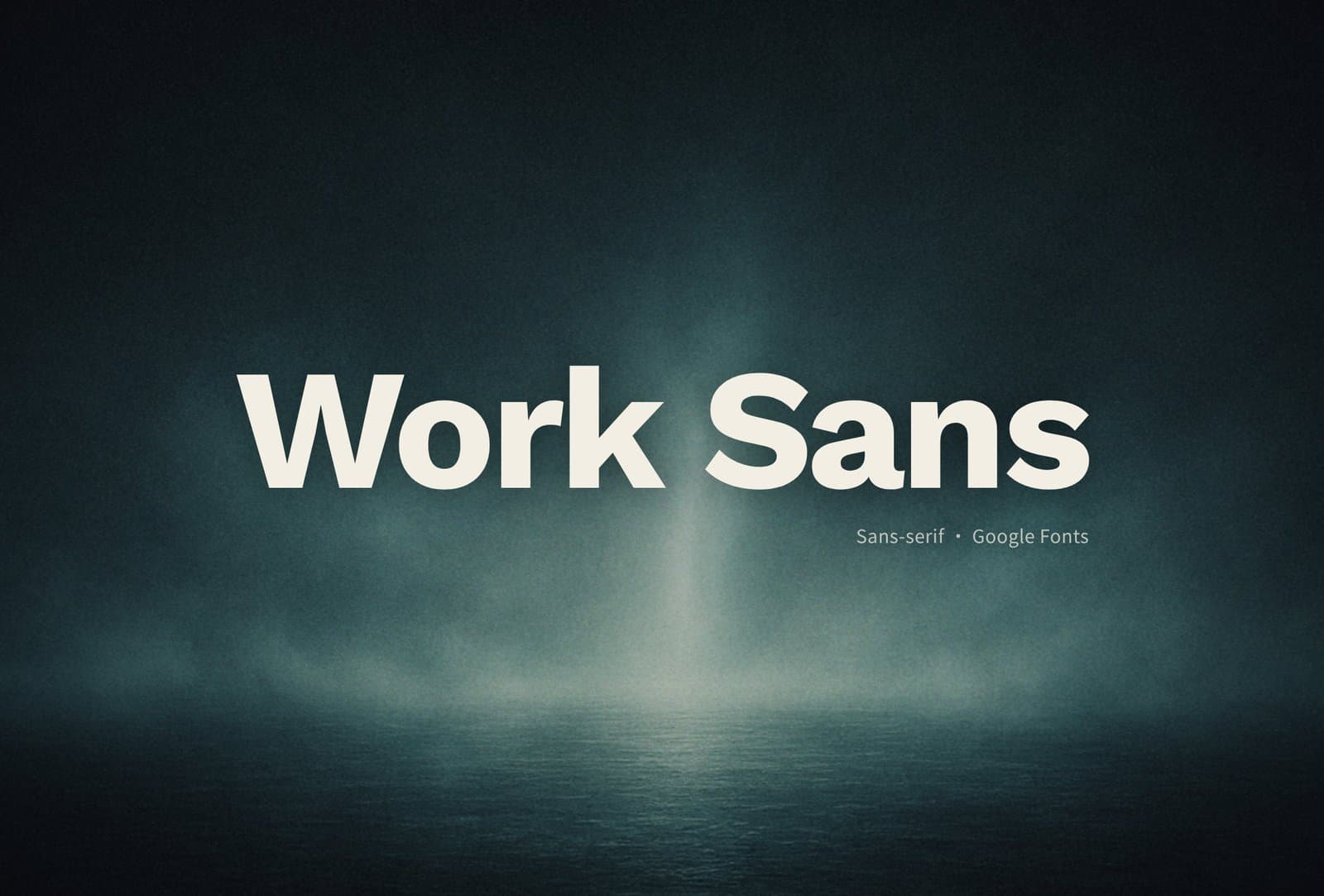
Work Sans
Google Fonts. Humanist-leaning geometric, easy on screen reading. Body copy, forms, admin UIs you stare at for hours — I look here first.
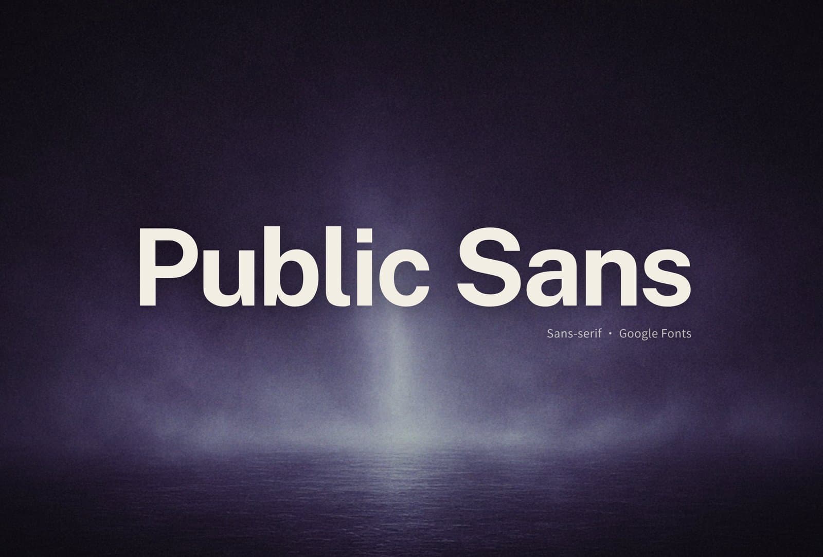
Public Sans
Google Fonts. From the U.S. Web Design System line — neutral and steady. Fits tools, docs sites, UIs that want a more "official" feel.
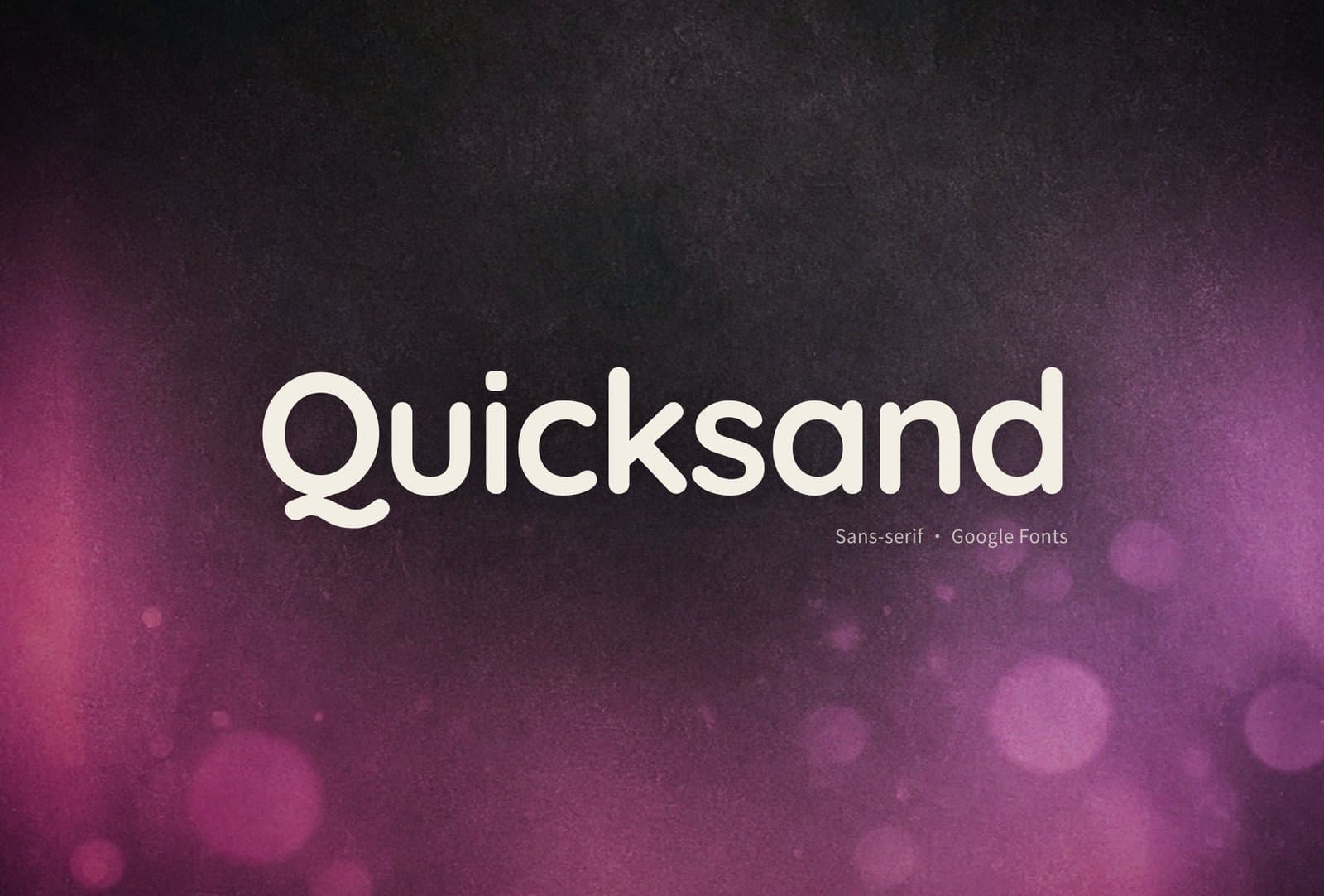
Quicksand
Google Fonts. Rounded geometric, soft and easygoing. Lifestyle, education, light consumer interfaces; I skip it for formal business work.
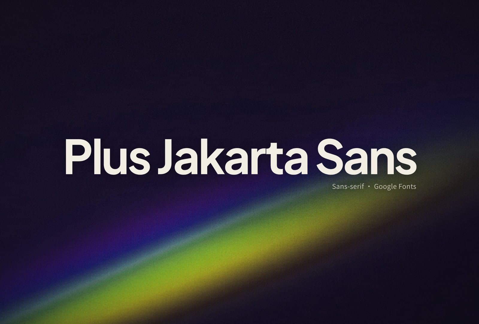
Plus Jakarta Sans
Google Fonts. Contemporary geometric sans, open and readable. SaaS, dashboards, modern product sites — it lands on my shortlist a lot.
Serif
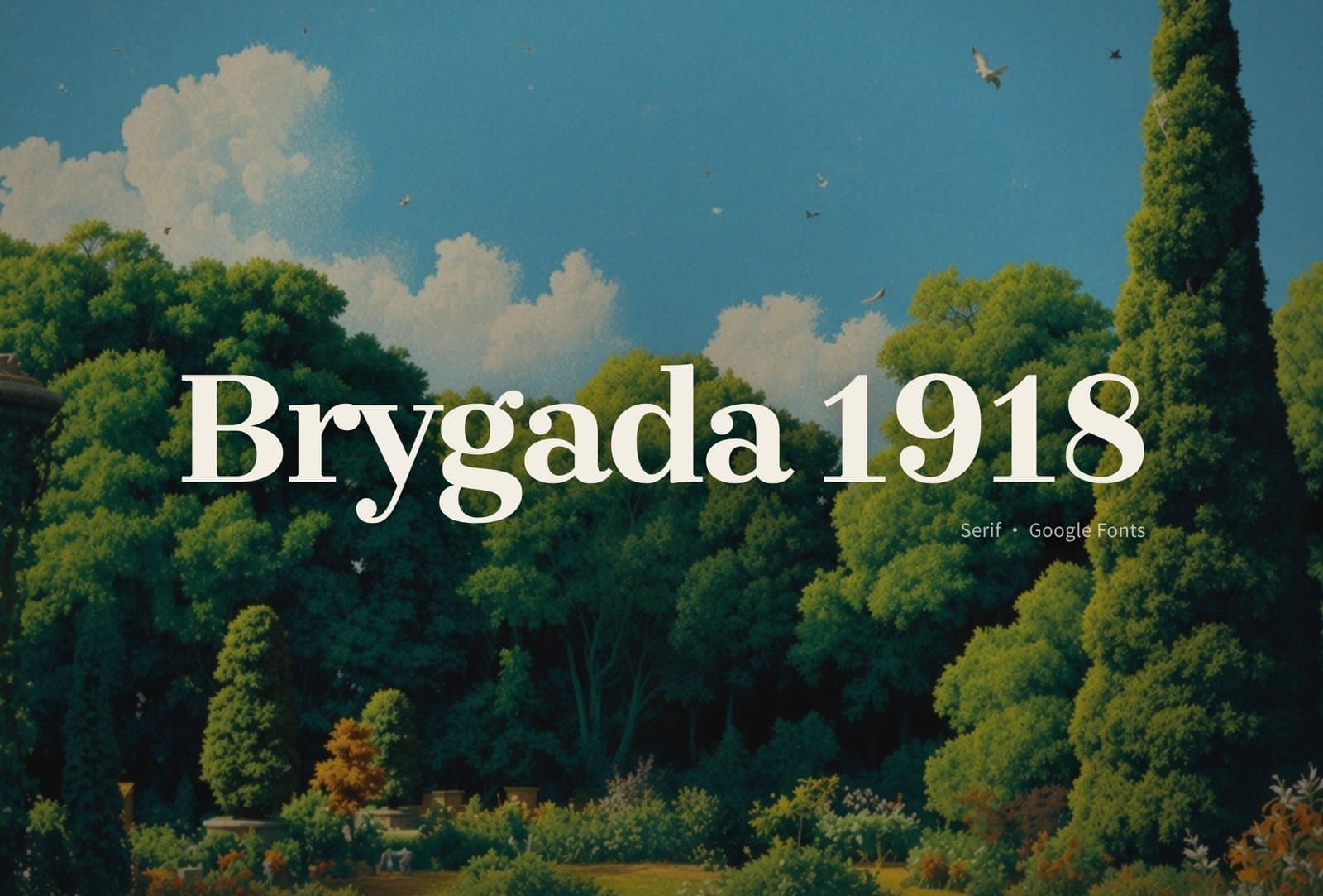
Brygada 1918
Google Fonts. Revival serif with a publishing feel. Long-form titles, editorial pages, anything that wants a bookish air.
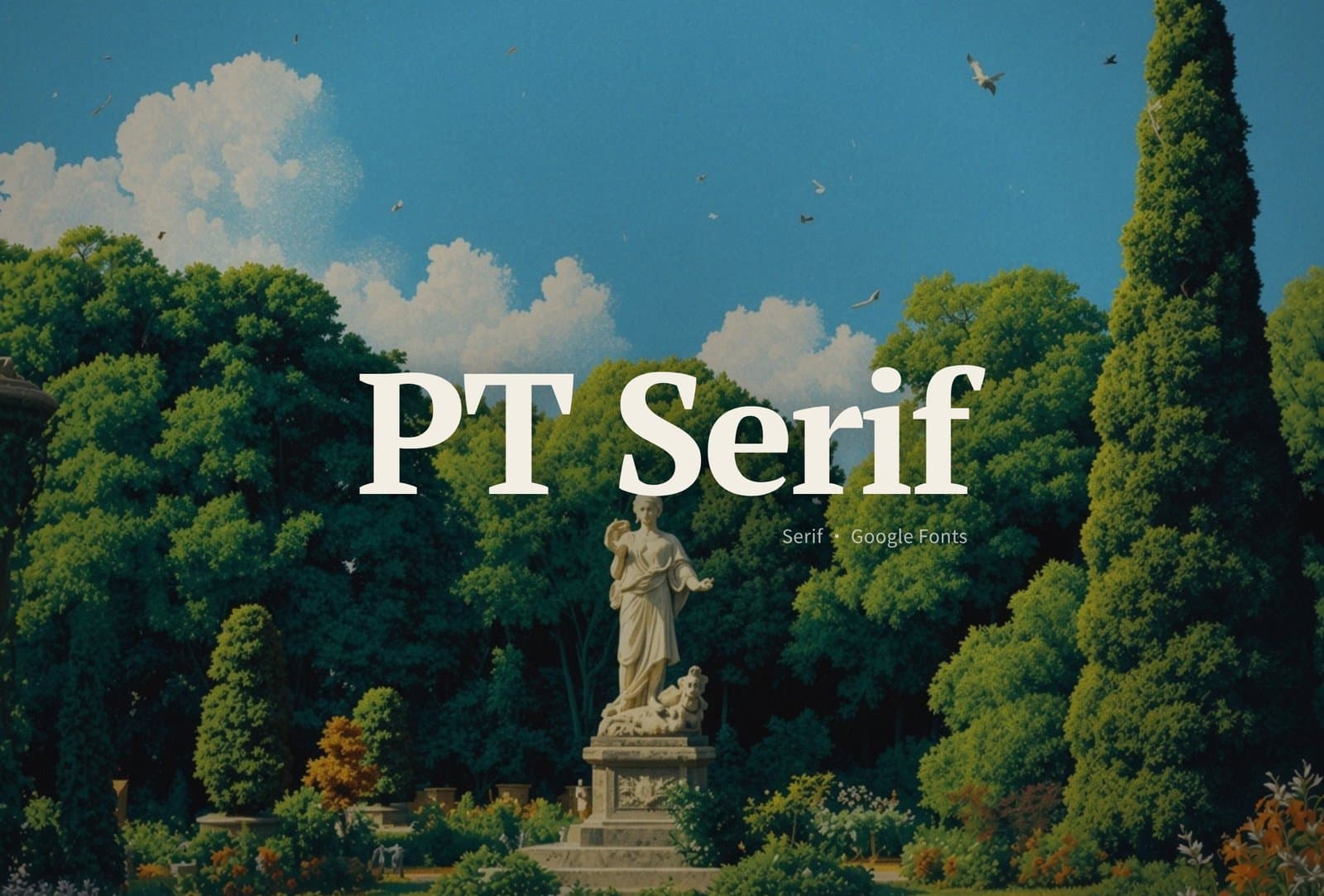
PT Serif
Google Fonts. Classic transitional serif, friendly for body. Blogs, explainers, long reading blocks — steadier than a flashy display face.
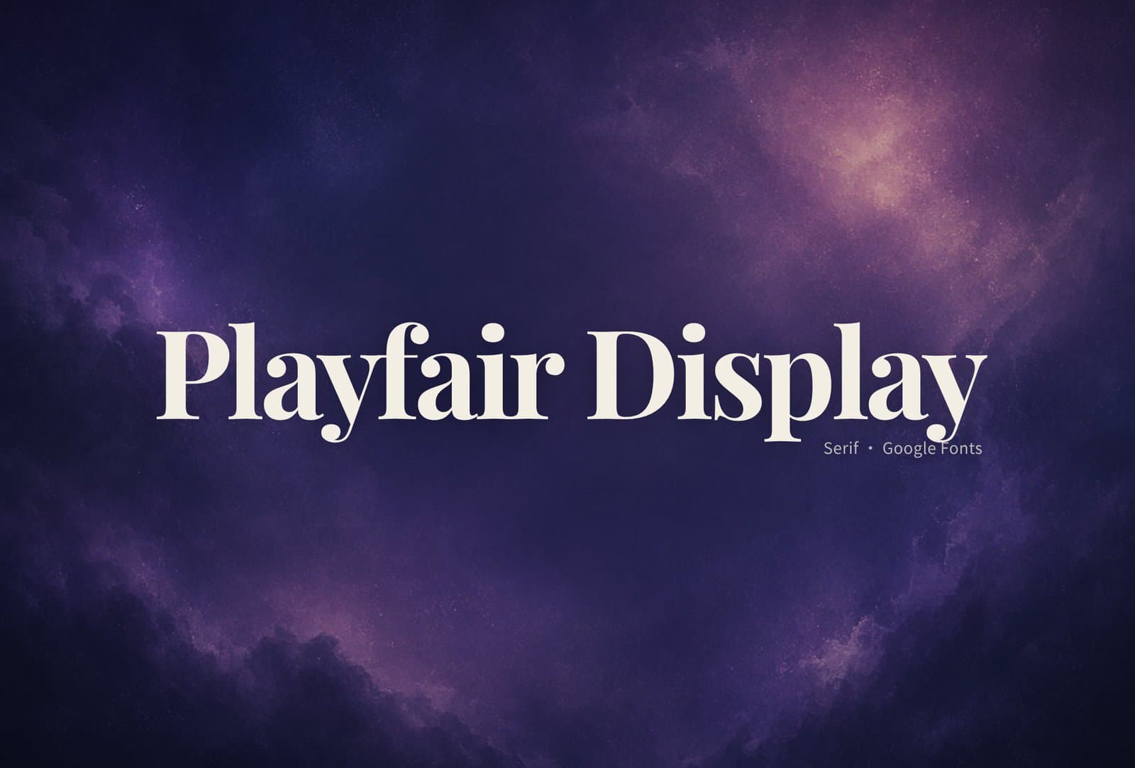
Playfair Display
Google Fonts. High-contrast display serif with drama. Big titles, covers, fashion / culture visuals; I don't force it into small body sizes.
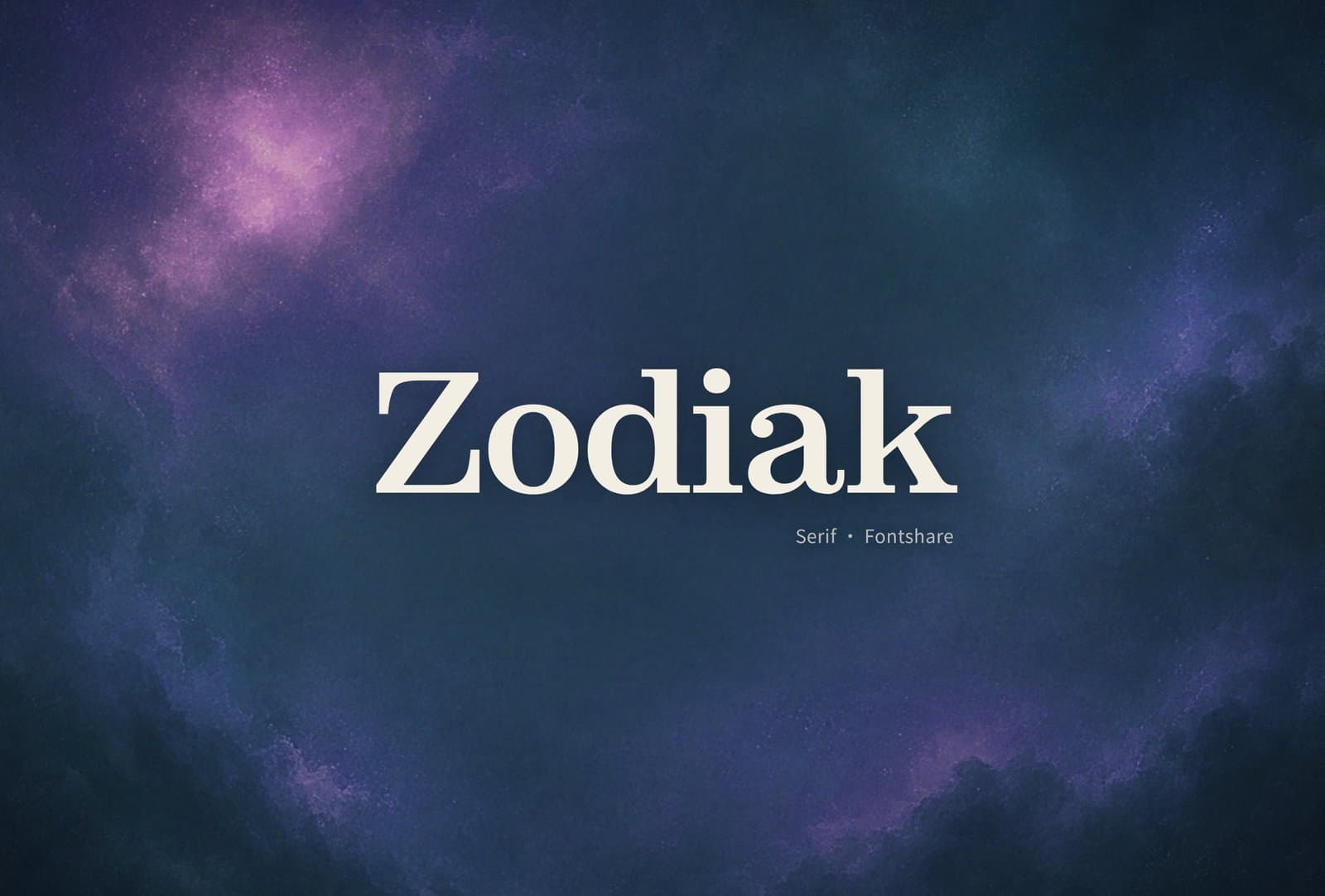
Zodiak
Fontshare. Contemporary serif, sharp and clean. Magazine-ish titles, brand story pages — when I want "a bit more expensive" without looking old.
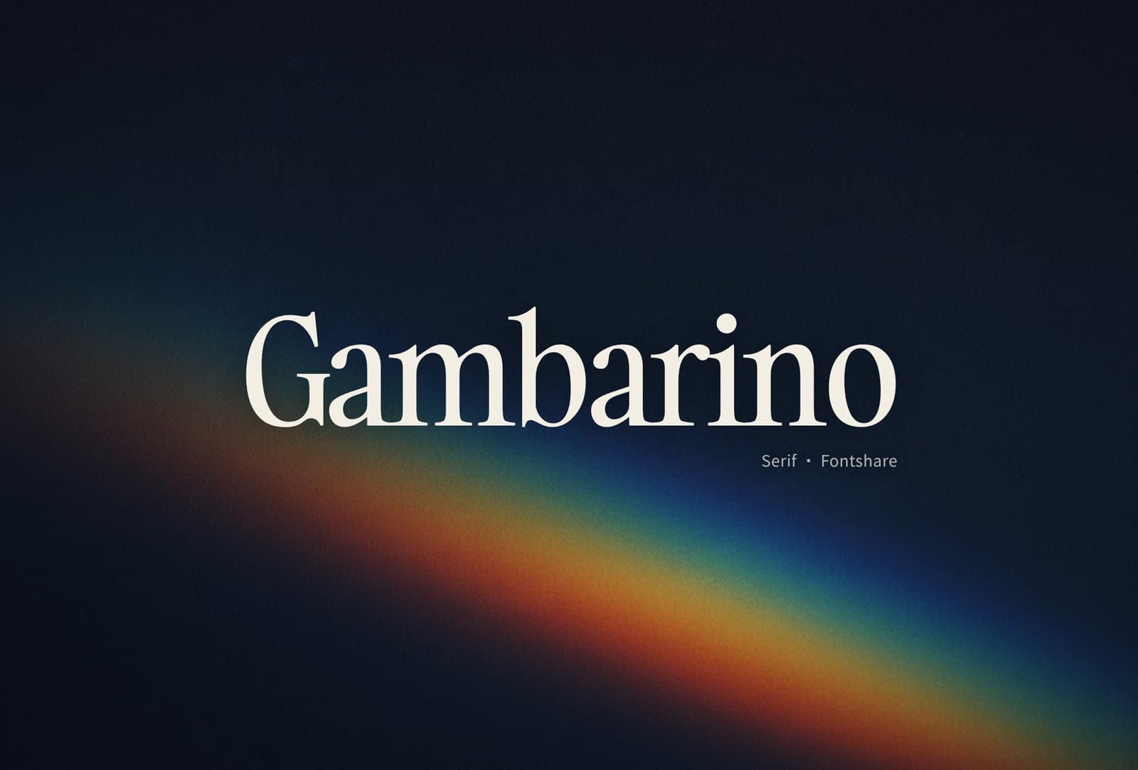
Gambarino
Fontshare. Strong display serif with high recognition. Posters, covers, a one-line slogan — it pops. Long body copy isn't its job.
How I pick
There's no "best" font — only what the page needs right now. My rough filter:
- Tools / admin / docs → Public Sans, Work Sans, Plus Jakarta Sans
- Product sites / SaaS → Figtree, Switzer, Satoshi, Plus Jakarta Sans
- Softer consumer vibes → Rubik, Quicksand
- Long-form / editorial → PT Serif, Brygada 1918
- Big titles / covers → Playfair Display, Zodiak, Gambarino
Inter and Roboto are still fine as defaults. Next time you want a different breath, pull one or two from this list and try them.